PythonDashPlotly
Australia Wildfire Dashboard
Explore Australia Wildfire Dashboard—an interactive app using Dash and Plotly. Analyse historical wildfire data, trends, fire intensity, and key metrics across regions with visual, insightful tools.
Stack
Python · Plotly · Pandas · Dash · HTML/CSS
Published
March 2025
Welcome to the Australia Wildfire Dashboard! This interactive web application provides insights into historical wildfire data across different regions of Australia. Built with Dash and Plotly, the dashboard allows users to explore wildfire trends, analyse fire intensity, and visualise key metrics over time.
🚀 Features
- —Interactive Filters:
- —Select a region (e.g., New South Wales, Queensland).
- —Choose a year to analyse wildfire data.
- —Visualisations:
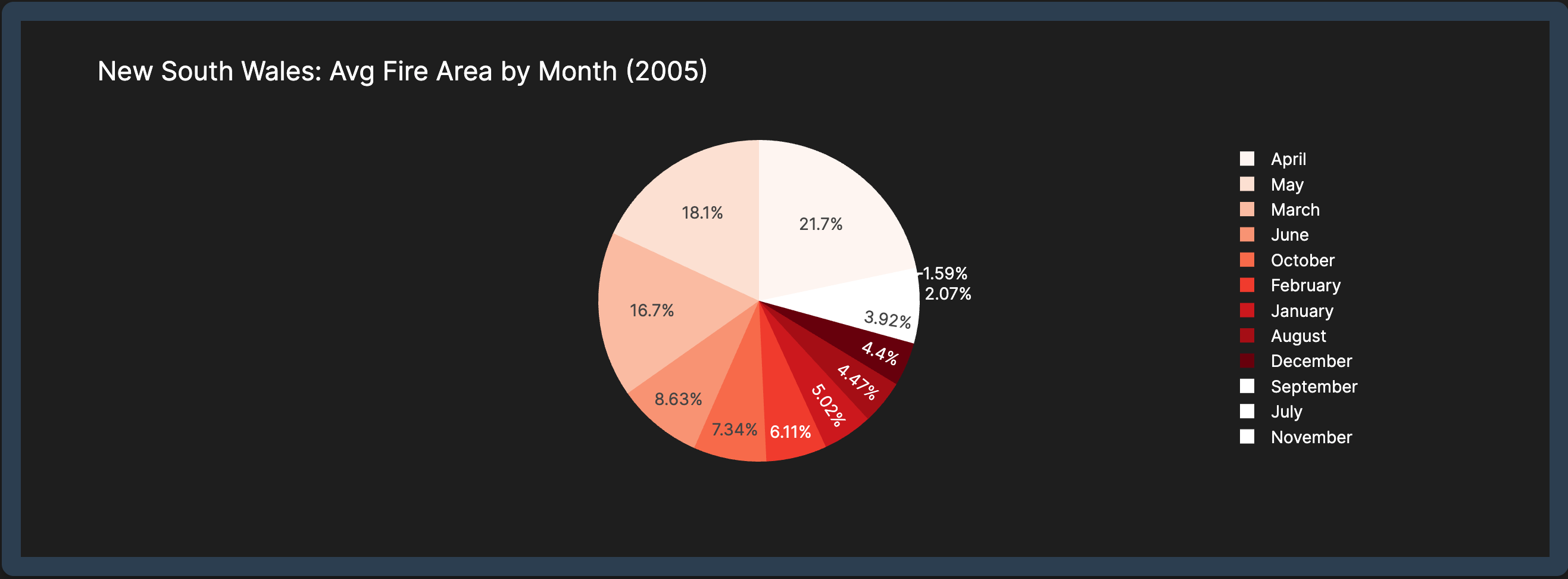
- —Pie Chart: Monthly average estimated fire area.
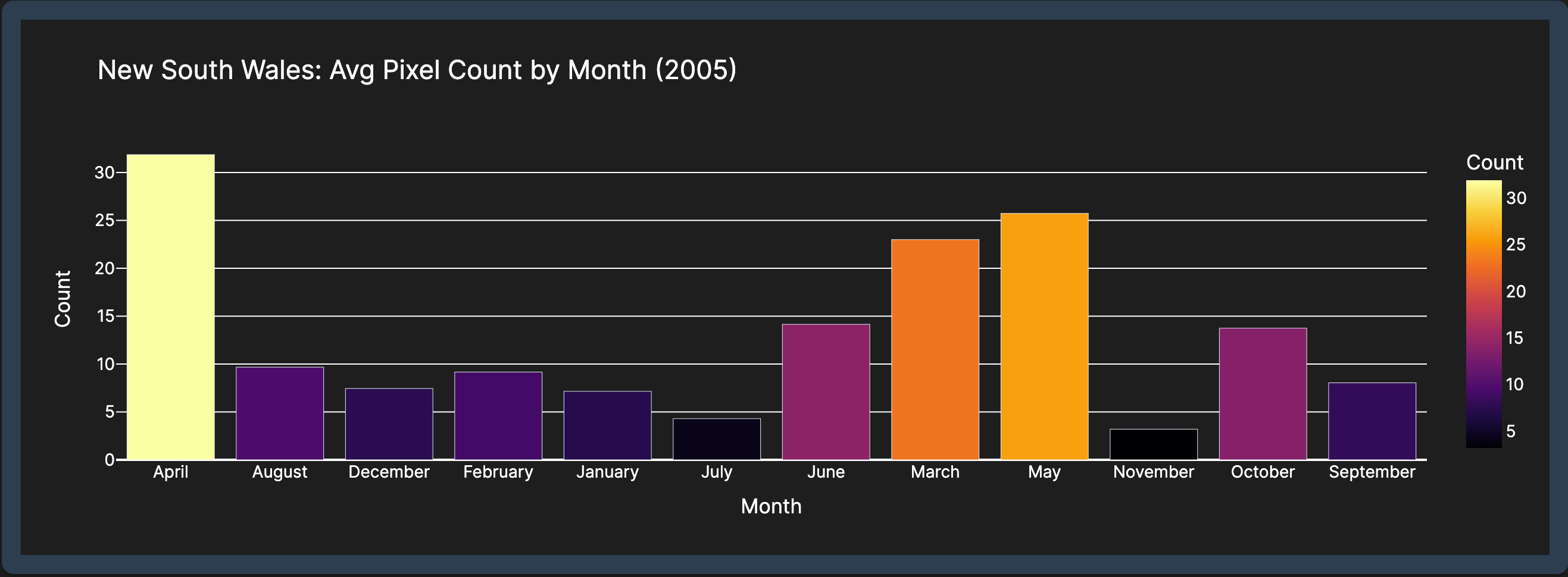
- —Bar Chart: Monthly average count of fire pixels.
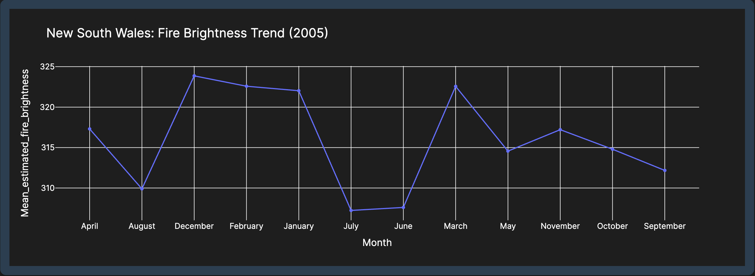
- —Line Chart: Mean fire brightness over time.
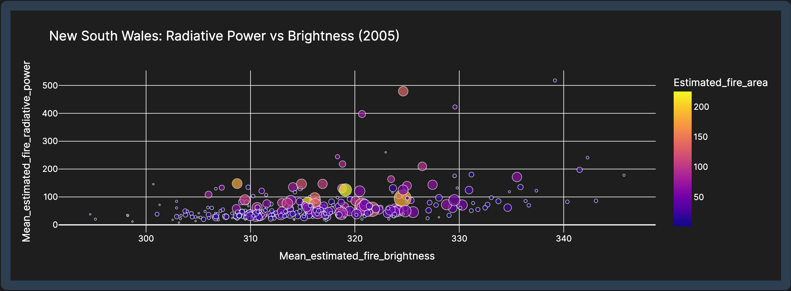
- —Scatter Plot: Relationship between fire radiative power and brightness.
- —Insights:
- —Identify months with the largest fire areas.
- —Track fire intensity and frequency over time.
- —Explore correlations between fire brightness and radiative power.
📊 Dataset
The dashboard uses the Historical Wildfires Dataset, which includes the following key columns:
Column NameDescriptionRegionAustralian region where the fire occurred.DateDate of the fire event.Estimated_fire_areaEstimated area affected by the fire (in hectares).Mean_estimated_fire_brightnessAverage brightness of the fire.Mean_estimated_fire_radiative_powerAverage radiative power of the fire.CountNumber of fire pixels detected.
📈 Visualisations
1. Monthly Average Estimated Fire Area (Pie Chart) Shows the distribution of fire area by month. Helps identify months with the largest fire areas.
2. Monthly Average Count of Fire Pixels (Bar Chart) Displays the frequency of fire pixels by month. Indicates how often fires occurred in each month.
3. Mean Fire Brightness Over Time (Line Chart) Tracks the average fire brightness over time. Higher values indicate more intense fires.
4. Fire Radiative Power vs. Brightness (Scatter Plot) Explores the relationship between fire radiative power and brightness. Larger and darker points represent fires with higher area and count.
🛠️ Technologies Used
Python: Core programming language.
- —Dash: Framework for building interactive web applications.
- —Plotly: Library for creating interactive visualisations.
- —Pandas: Data manipulation and analysis.
- —HTML/CSS: Styling and layout of the dashboard.