tableaudata visualisation
HR Analytics Dashboard
Comprehensive HR analytics dashboard visualising workforce demographics, salary trends, and performance insights using Tableau and Python-generated data.
Domain
Human Resource
Data Sources
Synthetic Data
Stack
Python · Tableau
Published
October 2025
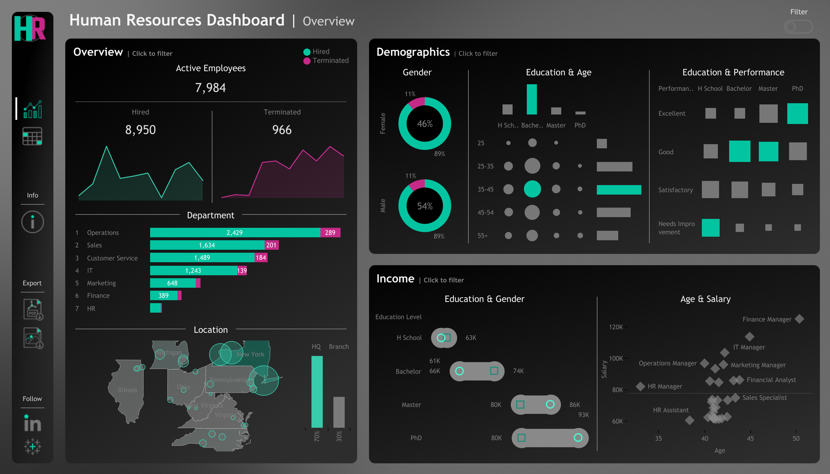
The HR Analytics Dashboard is an interactive Tableau project I designed and developed to visualise workforce data and uncover insights into employee demographics, performance, and salary trends. The project simulates a real-world HR analytics environment, allowing users to explore employee-related KPIs and patterns that help organisations make data-driven HR decisions.
Project Goal
The goal of the project was to build a comprehensive, user-friendly HR dashboard that enables HR managers to:
- —Track workforce composition and changes over time.
- —Identify demographic and educational distributions.
- —Analyse salary patterns and performance correlations.
- —Access detailed employee records for deeper insights.
Data Generation
The dataset was created using Python, the Faker library, and custom logic to generate 8,950 realistic HR records.
Key attributes included employee ID, name, gender, age, education, department, salary, performance rating, overtime, hire/termination dates, and adjusted salary (based on gender, education, and age).
Probabilities and mappings were carefully applied to replicate realistic distributions — such as gender ratio, departmental staffing, salary ranges, and yearly hiring trends — ensuring data consistency and authenticity.
Dashboard Design Process
- 1.Mockup and Wireframing: The dashboard layout was planned in Procreate and draw.io to define sections and visual hierarchy.
- 2.Design Elements: Icons were customised in Photopea to maintain colour consistency and branding.
- 3.Tableau Development: Using Tableau Public, I connected the dataset, performed field calculations (such as attrition rates, adjusted salary metrics, and departmental breakdowns), and created three main dashboard views:
- —Overview: Displays company-wide statistics on total, active, and terminated employees, as well as department and location insights.
- —Demographics: Shows gender ratios, age distributions, education levels, and correlations between education and performance.
- —Income Analysis: Compares salary levels by gender, education, and department, identifying pay patterns and age-salary relationships.
- —Employee Records: Interactive table view enabling dynamic filtering and employee-level exploration.
Tools & Technologies
- —Tableau Public for data visualisation and dashboard creation
- —Python (Pandas, Faker, Numpy) for synthetic data generation
- —Figma, Draw.io, and Procreate for design and layout mockups
Key Insights
- —Identified that departments like Sales and Operations have the highest employee count.
- —Found gender-based salary differences across education levels.
- —Highlighted age and experience correlations with higher pay and performance scores.
- —Visualised workforce distribution across multiple states, with New York serving as the headquarters.
Project Impact
This dashboard replicates the analytical capabilities of a professional HR reporting system — providing actionable insights for workforce planning, DEI initiatives, and compensation analysis. It demonstrates my end-to-end ability to generate data, clean and transform it using Python, and visualise insights through a polished and interactive Tableau interface.