Featured Project
FeaturedPredictiveModellingInsuranceData Science
Macroeconomic Impact on General Insurance Claims
When inflation rises, insurance claims get more expensive — but the bill doesn't arrive until months later. Using ABS, RBA, and APRA data, I built an analytics system to detect economic warning signals before they hit the books: lead-lag correlations, predictive models, and a live stress-test dashboard for four macro scenarios.
Domain
General Insurance · Macro
Data Sources
ABS · RBA · APRA
Stack
Python · Scikit-learn · Streamlit · Plotly · Pandas
Published
April 2026
Project Overview
When inflation rises, insurance claims get more expensive — but the bill doesn't arrive until months later. This project asks: can publicly available economic data give insurers an early warning, before the cost hits the books? Using data from the Australian Bureau of Statistics, the Reserve Bank of Australia, and APRA, I built an analytics system to find out.
Built for three audiences inside an insurance business: the Head of Claims (to flag rising severity early), the CFO (to stress-test reserves), and Underwriting (to reassess pricing assumptions before they become losses).
The Problem
Insurance prices today, inflation tomorrow
When you insure your home, the insurer sets your premium based on what repairs and rebuilds cost right now. But if inflation pushes up wages and building materials over the next 12–18 months, claims predicted to cost $80,000 might end up costing $100,000. The insurer is locked into a price they set before the bill arrived.
This lag between the economy and insurance costs is well known in the industry — but it's notoriously difficult to quantify. The question this project set out to answer: can we see the cost pressure coming in the economic data, before it shows up in claims?
The Data
Five government data sources — one critical constraint
All data used in this project is freely available from Australian government agencies. I combined five economic and regulatory data series to build a single analytical dataset spanning 1997 to 2026.
- —ABS Consumer Price Index — how much more expensive insurance-related goods are getting, monthly
- —ABS Wage Price Index — how fast wages are rising (labour is the biggest cost in repairs)
- —ABS Construction PPI — how much building materials and construction costs are changing
- —RBA Cash Rate Target — the official interest rate, which influences spending, inflation, and economic activity
- —APRA Insurance Claims & Premiums — actual quarterly claims and loss ratios for Home and Motor insurance (only 9 quarters available due to APRA's 2023 format change)
The biggest constraint in this project: APRA changed its reporting format in 2023, so detailed class-level insurance data only goes back 9 quarters. That's a short window — it directly limits statistical confidence and is acknowledged throughout the analysis.
Key Findings
01 — Building costs and wages have been rising for a decade
Wages in Australia have risen +32.5% since 2015. Construction material costs have risen +51.4% over the same period. Every claim that involves repairing a home, rebuilding a structure, or paying a tradesperson draws on these costs directly.
In plain terms: the average smash repair or home rebuild costs significantly more today than it did in 2015 — not because accidents are worse, but because labour and materials are more expensive. Insurers who priced policies before this inflation hit are paying claims that cost more than expected.
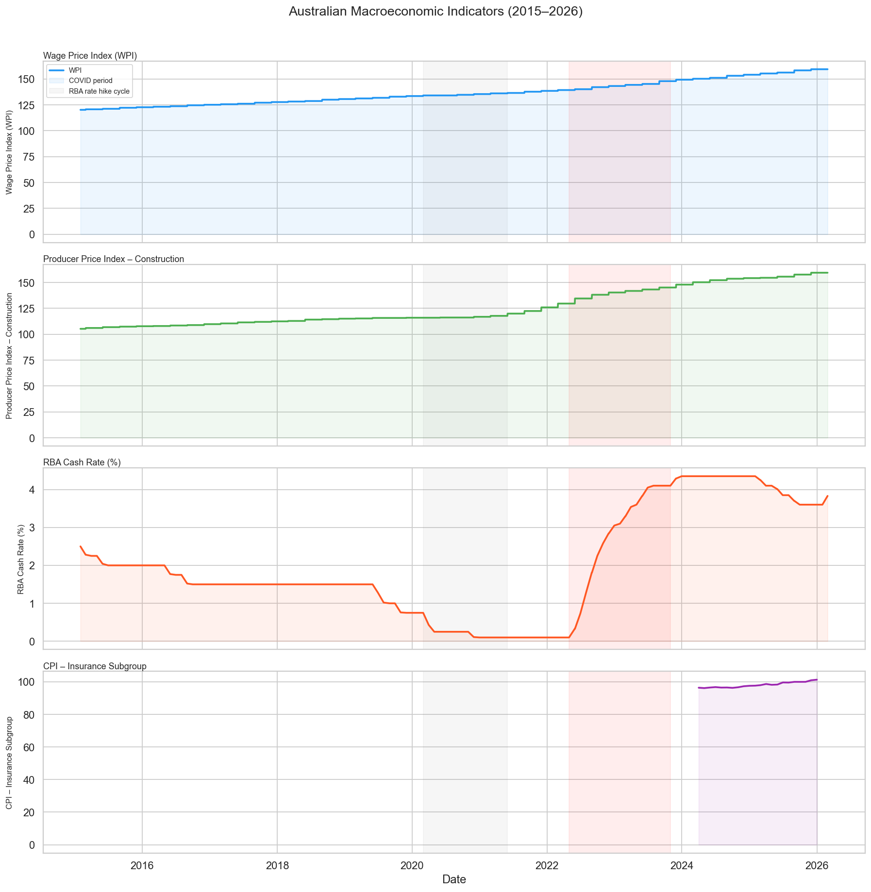
Chart 01 — Macro Indicator Trends (2015–2026): Wage growth and construction costs have climbed steadily for a decade — the structural pressure behind rising repair and rebuild costs. The cash rate tells a dramatic story: cut to emergency lows during COVID in 2020, then hiked at the fastest pace in 30 years through 2022–2023, before easing again from 2024.
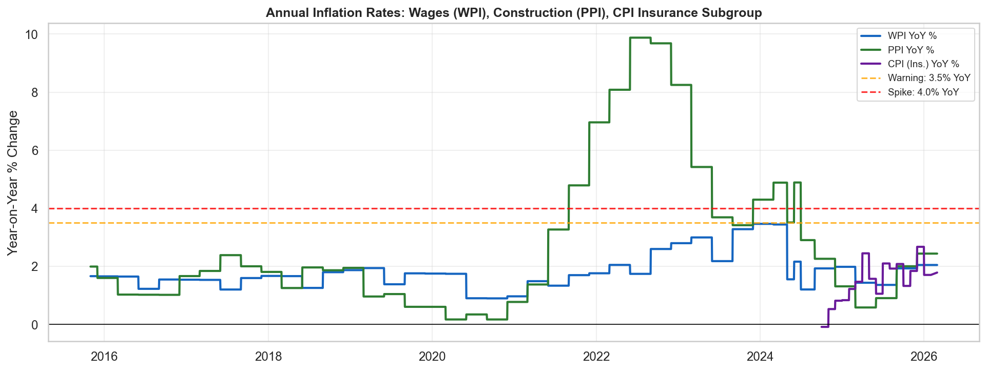
Chart 02 — Annual Inflation Rates: Wages, Construction, and CPI. The amber dashed line marks 3.5% — a threshold above which insurers historically see repair cost pressure. Wages and construction costs both crossed this threshold during 2022–2023, with wages reaching ~4.5% annual growth.
02 — Interest rates predicted insurance claim ratios 2–3 quarters ahead
Of all the economic indicators tested, the RBA cash rate showed the clearest relationship with insurance claim costs. Higher interest rates correlated with lower claim costs — and lower rates with higher costs.
In plain terms: when the RBA raised rates aggressively in 2022–23, it slowed the economy. People drove less, spent less, were more cautious — and made fewer insurance claims. When rates were cut in 2024–25, activity picked back up and claims started rising again. The cash rate gave a 2–3 quarter heads-up before the claims data moved.
Correlation strength: Motor insurance −0.668 at 6-month lag · Home insurance −0.655 at 9-month lag
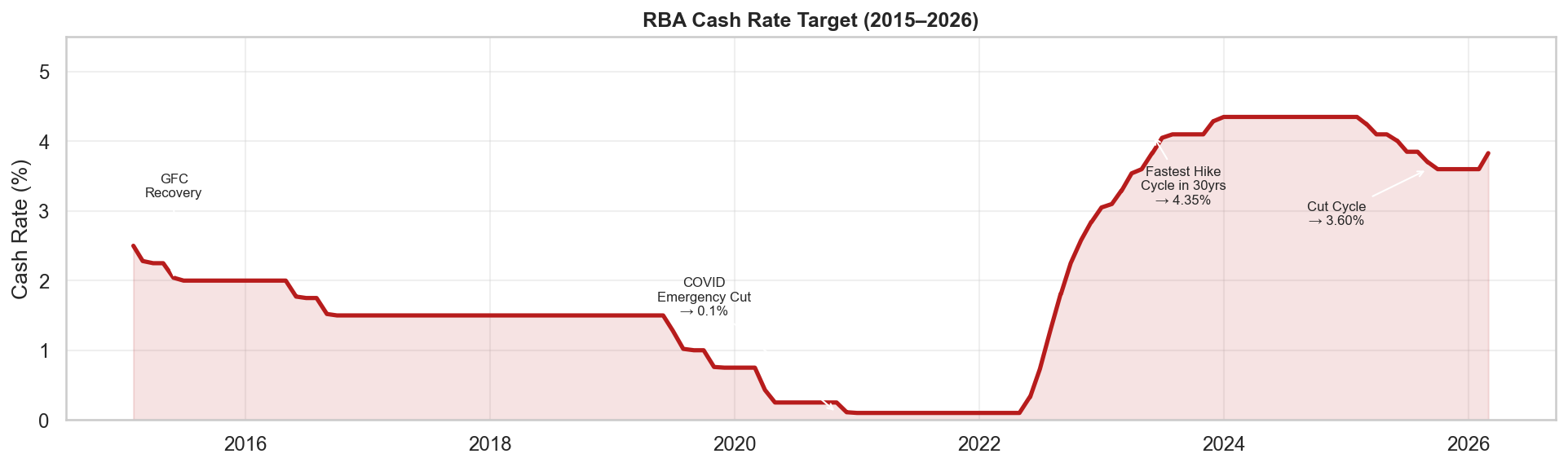
Chart 03 — RBA Cash Rate: Key Policy Milestones. The COVID cut to 0.1% (2020) was the lowest on record. The subsequent hike to 4.35% by late 2023 was the fastest tightening cycle since the early 1990s. The easing that began mid-2024 brought the rate to 3.60% by late 2025. Each turning point has a corresponding lagged effect on insurance claim frequency and severity.
03 — Home insurance swings wildly with weather; motor insurance is predictable
Quarterly home insurance claims ranged from $1.7 billion to $5.4 billion in a single year — a 3× swing driven primarily by summer weather events (floods, storms, bushfires). Car insurance claims, by contrast, were steady at $3.2B–$4.3B per quarter.
In plain terms: you can't predict home insurance claims from economic data alone, because a single bad cyclone season adds billions in claims that have nothing to do with wages or inflation. Car insurance is more useful for this kind of analysis — it's driven by steady factors like accident frequency and gradually rising repair costs, not catastrophic weather events.
The loss ratio (how much of every premium dollar is paid out in claims) breached 100% for home insurance twice in the data — meaning APRA-regulated insurers paid out more in claims than they collected in premiums in those quarters.
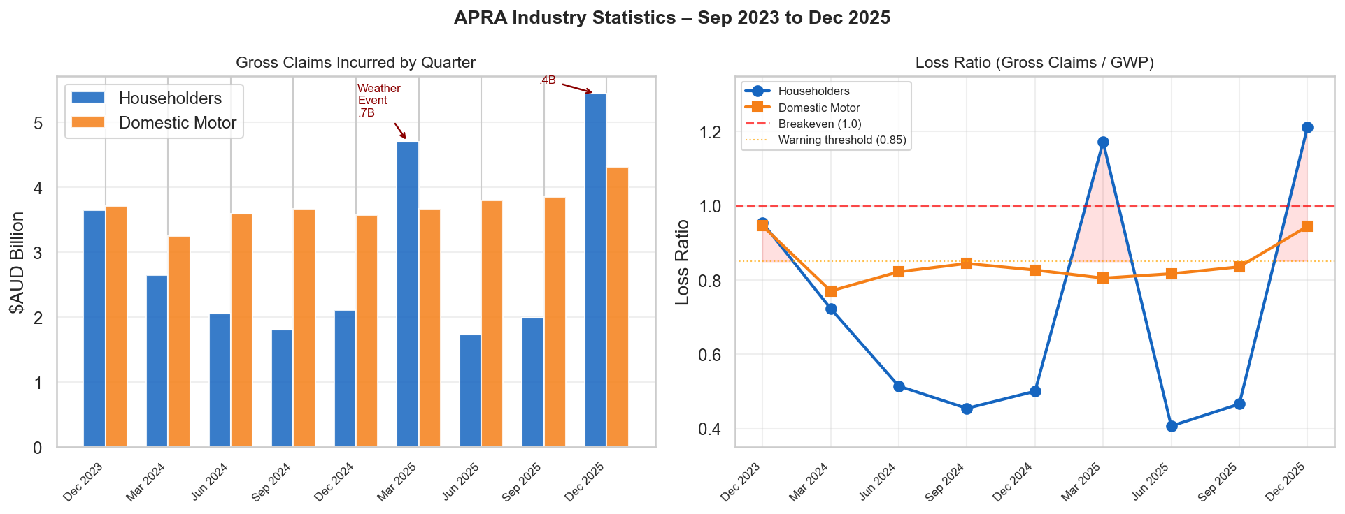
Chart 04 — APRA Insurance Claims & Loss Ratios (2023–2025): Quarterly gross claims (bars) and loss ratios (lines) for Home and Motor insurance. The massive spikes in home insurance correspond to Australian summer weather events — Q1 and Q4, when floods and storms peak. The dashed line at 1.0 marks the break-even point: anything above means claims exceed premiums collected.
04 — The economy moves first, claims follow 2–6 quarters later
The lag-correlation heatmap shows how strongly each economic indicator (at different time delays) correlates with insurance loss ratios. The cash rate stands out at 2–3 quarters lag. Wage and construction cost data shows relationships at longer lags (4–5 quarters), but the limited APRA data window means we can't confirm these with statistical confidence yet.
How to read this: each row is a combination of an economic indicator and an insurance measure. Each column is a different time delay (1 quarter = 3 months, up to 6 quarters = 18 months). Empty cells (NaN) mean there wasn't enough data to calculate — a direct consequence of APRA only having 9 quarters of data available.
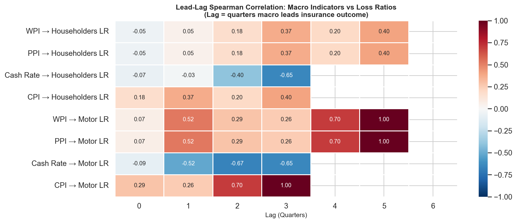
Chart 05 — Lead-Lag Correlation Heatmap: Each cell shows how closely an economic indicator (at a given time delay) moves with insurance loss ratios. The cash rate rows show the strongest and most consistent signal. Empty cells reflect the 9-quarter APRA data limit — at 5+ quarter lags, there simply aren't enough data points to calculate a meaningful correlation.
Stress Testing
Four economic scenarios modelled
Using the relationships found in the data, I modelled how different economic futures would affect an insurer's home insurance loss ratio — and what it would cost in additional reserves.
The loss ratio is a key insurance metric: the percentage of premiums paid out in claims. A loss ratio of 0.720 means 72 cents of every premium dollar goes to claims. Higher is worse for the insurer.
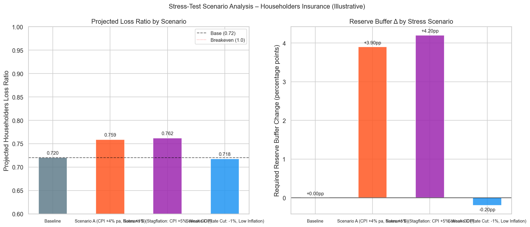
Chart 06 — Stress Test: Projected Loss Ratios Under Four Scenarios. The baseline (current conditions) sits at 0.720. Persistent inflation pushes this to 0.759. The stagflation scenario — high inflation combined with slow growth — produces the worst outcome at 0.762, requiring an additional $168M in quarterly reserves at current premium levels.
Scenario Summary
- 1.Baseline (current conditions) — projected loss ratio 0.720, no change to reserves required
- 2.Persistent inflation (prices rising 4%+/year) — loss ratio 0.759, +3.9 percentage points above baseline
- 3.Stagflation — worst case (high inflation + slow growth) — loss ratio 0.762, requires approximately $168M in additional quarterly reserves at current premium levels
- 4.Rate cut / soft landing (inflation cools, economy stabilises) — loss ratio 0.718, marginal improvement of −0.2 percentage points
How the Analysis Was Built
Six stages from raw government spreadsheets to a live interactive dashboard.
01 — Collect
Downloading and cleaning five government data sources
Raw Excel files from ABS, RBA, and APRA were cleaned and standardised. A key challenge: government spreadsheets store 9 rows of metadata before the actual data — the code had to dynamically detect where the real data starts, rather than assuming a fixed row number.
02 — Engineer
Transforming raw data into 18 analytical features
Each series was transformed into year-on-year percentage changes, rolling averages, and acceleration measures. Time-delayed versions of each indicator (up to 18 months back) were calculated to test whether the economy leads insurance claims.
03 — Explore
Visualising relationships across time
Each economic indicator was plotted alongside insurance claims to look for visual relationships. Correlation statistics were calculated at every lag interval (every 3 months up to 18 months) to find where the timing relationship was strongest.
04 — Model
Three prediction models compared honestly
Three statistical models were compared: a basic OLS model, and two regularised models (Ridge and Lasso) designed to prevent overfitting. The basic model produced suspiciously perfect results — a sign it was memorising the small dataset. The constrained models gave more realistic, honest estimates.
05 — Stress Test
Projecting insurance costs across four economic futures
Using the model relationships, four economic scenarios (baseline, persistent inflation, stagflation, rate cut) were projected to estimate their impact on home insurance loss ratios and the additional reserves an insurer would need to hold.
06 — Dashboard
Four-page interactive Streamlit app for stakeholder exploration
All findings were packaged into a Streamlit web application with four pages: Macro Trends, Insurance Performance, Correlation Explorer, and a live Scenario Stress Test where stakeholders can adjust economic assumptions with sliders and see the projected impact in real time — without needing to understand the underlying model.
Honest Limitations
With only 9 quarters of detailed insurance data available, none of the statistical relationships found here reach the threshold required for scientific certainty. Every result should be read as directional evidence, not proof.
The home insurance spikes in early and late 2025 were almost certainly driven by weather events — not by inflation. A complete model would need to account for catastrophe events separately, using data like insurance industry catastrophe loss tables or Bureau of Meteorology event records.
Correlation also isn't causation: this analysis does not prove that rising wages cause insurance claims to increase. It shows they tend to move together over time — which is commercially useful, but a more limited claim.
What would make this stronger: APRA publishes separate annual reports going back to 2012. Manually appending those reports would extend the insurance dataset to approximately 40 quarters — enough to reach statistical confidence and validate the relationships found here. That work is scoped as the next phase of this project.
Skills Demonstrated
Data Engineering
- —Multi-source ingestion
- —Dynamic header detection
- —Deduplication
- —Frequency alignment across monthly, quarterly, and annual series
Statistical Analysis
- —Spearman rank correlation
- —Lead-lag testing across 0–18 month windows
- —Significance testing under small-N constraints
- —Honest treatment of data limitations
Predictive Modelling
- —OLS regression
- —Ridge regularisation
- —Lasso feature selection
- —Time-series backtesting
Visualisation
- —Plotly interactive charts
- —Seaborn correlation heatmaps
- —Dual-axis time-series plots
- —Annotated policy milestone charts
Insurance Domain
- —Loss ratio analysis
- —APRA regulatory data interpretation
- —AASB 17 reserve concepts
- —RBA policy cycle effects on claims
Product Delivery
- —Streamlit multi-page dashboard
- —Live scenario stress-test with interactive sliders
- —Stakeholder-framed findings (CFO, Claims, Underwriting)