Featured Project
FeaturedDataWarehouseInsuranceETLSQLDataEngineering
NFIP Insurance Data Warehouse
End-to-end insurance data warehouse built on 1.7M real flood insurance claims and 1M policies from FEMA's NFIP, ingested via REST API. Medallion Architecture pipeline producing loss ratios, claims triangles, and portfolio-level KPIs across five US states.
Domain
General Insurance · Flood Insurance · Data Engineering
Data Sources
OpenFEMA API · NFIP Redacted Policies v2 · NFIP Redacted Claims v2
Stack
Python · T-SQL · SQL Server · Azure SQL Edge · Docker · pandas · pyodbc · matplotlib · seaborn
Published
April 2026
General insurers manage risk across two core data domains — the policies they underwrite and the claims those policies generate. These datasets originate from separate operational systems and must be joined, reconciled, and structured before any analytics can occur. This project builds that foundational data infrastructure using real flood insurance data at genuine scale.
The Data
The warehouse ingests real claims and policy data from FEMA's National Flood Insurance Program via the OpenFEMA REST API — no static CSV download. A Python ingestion pipeline makes paginated API calls filtered to five high-risk US states (Florida, Louisiana, Texas, New Jersey, New York), handling rate limiting, retry logic, column selection, and resume support across sessions. Result: 1,703,977 claims transactions and 1,000,000 policy records loaded into a three-layer Medallion pipeline.
The Architecture
Bronze stores raw API data as-is in VARCHAR columns with full audit metadata — batch ID, ingestion timestamp, source endpoint. The dynamic table creation approach means the schema adapts to actual API column names rather than assumed ones, which proved essential when the OpenFEMA API returned field names that differed from documentation.
Silver applies data type casting, NULL handling, deduplication, flood zone normalisation (mapping raw NFIP zone codes to A/V/X/D categories), FIPS state resolution, and policy exposure derivation. Of the 1,703,977 Bronze claims, 1,328,816 survive to Silver after deduplication and NULL date filtering — a documented 22% drop.
Gold implements a star schema with two fact tables and five conformed dimensions — 1,329,004 claim facts and 823,465 policy facts, joined to a 19,358-row date dimension spanning the full NFIP history from 1978 to 2030, 469 location entries across five states, and 68 distinct flood zone codes normalised to five categories.
Key Findings from the Analytics Layer
Large loss concentration — The P95 loss threshold across the portfolio is $185,607 per claim. Florida leads with 22,119 catastrophic claims totalling $7.54B — 41.8% of its entire total paid comes from just the top 5% of losses. Texas shows 18,242 large losses at $4.9B (31.3% concentration). This tail-driven loss pattern is characteristic of flood insurance and has direct implications for catastrophe reinsurance pricing.
Claims development by accident year — The data spans the full history of US flood insurance. 2005 (Katrina) generated 131,431 claims and $10.1B in total paid — the largest single accident year in the dataset. 2017 (Harvey) produced 97,064 claims at an average severity of $90,735 per claim. 2012 (Sandy) generated 138,117 claims at $60,596 average. Average severity has risen significantly over time, reflecting both increased property values and more severe flood events.
Severity by flood zone — Zone V (coastal high-risk with wave action) averages $50,119 per claim with 88.5% of losses concentrated in building damage rather than contents — consistent with storm surge destroying structures while leaving contents losses relatively lower. Zone A (standard high-risk, 858,904 claims) averages $52,836. Zone X (moderate-to-low risk) averages $43,017 — a meaningful 19% reduction from high-risk zones, validating the SFHA classification system as a pricing signal.
Portfolio trends — The portfolio summary shows year-over-year premium and claims trends from 2009 to 2025. 2022 stands out with a loss ratio of 49.85x driven by $4.54B in claims against a limited policy sample — reflecting the known underinsurance problem in high-flood-risk areas, particularly in Louisiana and coastal Texas.
Documented Limitations
The loss ratio view produces inflated ratios for some state-year combinations because the policy dataset is capped at 200,000 records per state by the API ingestion script, meaning premium totals do not represent full market exposure. The premium adequacy view shows numeric occupancy codes in some segments due to a dimension join gap between claims and policies data — claims do not carry a construction class field, so segments without policy matches show "No Policy Data." Both limitations are documented in the data quality notes.
These are honest constraints of working with redacted, capped public data — and the kind of data quality findings a real analytics team would surface and document in a production warehouse.
Why Flood Insurance
Flood risk is a first-order concern in Australian general insurance. The 2022 Eastern Australia floods triggered the largest insured loss event in the country's history, and the Australian Government established the ARPC Cyclone Reinsurance Pool the same year. NFIP is the closest publicly available analogue to Australian flood insurance data at transaction level — building a warehouse on it demonstrates competence in a domain every Australian insurer is actively investing in.
How It Connects
This warehouse is the engineering layer in a three-project insurance analytics stack. The Predictive Claims Liability Model consumes structured policy data to forecast pure premium using Tweedie regression across 677k policies. The Macroeconomic Resilience project stress-tests portfolio KPIs against ABS and RBA economic scenarios. Three projects, three layers of the same analytics stack — mirroring how data teams operate inside real insurers.
Technical Stack
Python (requests, pandas, pyodbc) for API ingestion and Bronze loading. Matplotlib and Seaborn for data visualisation from Gold layer query output. T-SQL for all ETL logic, dimensional modelling, and analytics views. SQL Server (Azure SQL Edge via Docker) as the database engine. Draw.io for architecture and ERD diagrams. Git and GitHub for version control.
Key Numbers
1,703,977 claims ingested via REST API across 5 states. 1,000,000 policy records. 1,329,004 Gold-layer fact records after cleaning and deduplication. 823,465 policy facts with exposure-weighted metrics. 7 insurance KPI analytics views. 19,358-row date dimension spanning 1978 to 2030. 469 location dimension entries across 5 states.
This project runs locally via Docker — no live demo is available. All query results and visualisations shown above were generated from a live pipeline run against the OpenFEMA API.
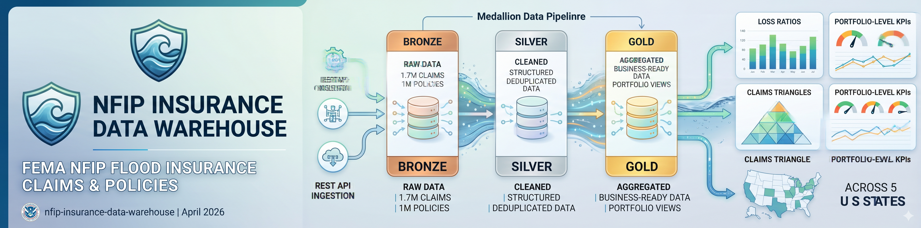
Architecture, Schema & ETL Diagrams
Image 1: Data Architecture — OpenFEMA API to Gold Star Schema
End-to-end pipeline from REST API source to analytics-ready dimensional model
Shows the complete data flow from source to analytics output. The OpenFEMA REST API feeds a Python ingestion script that fetches paginated, state-filtered claims and policy data into state-partitioned CSVs. These load into the Bronze layer via pyodbc, where raw VARCHAR staging tables preserve data exactly as received. The Silver layer applies cleaning and conforming transforms before the Gold layer produces a star schema with two fact tables, five dimension tables, and seven analytics views.
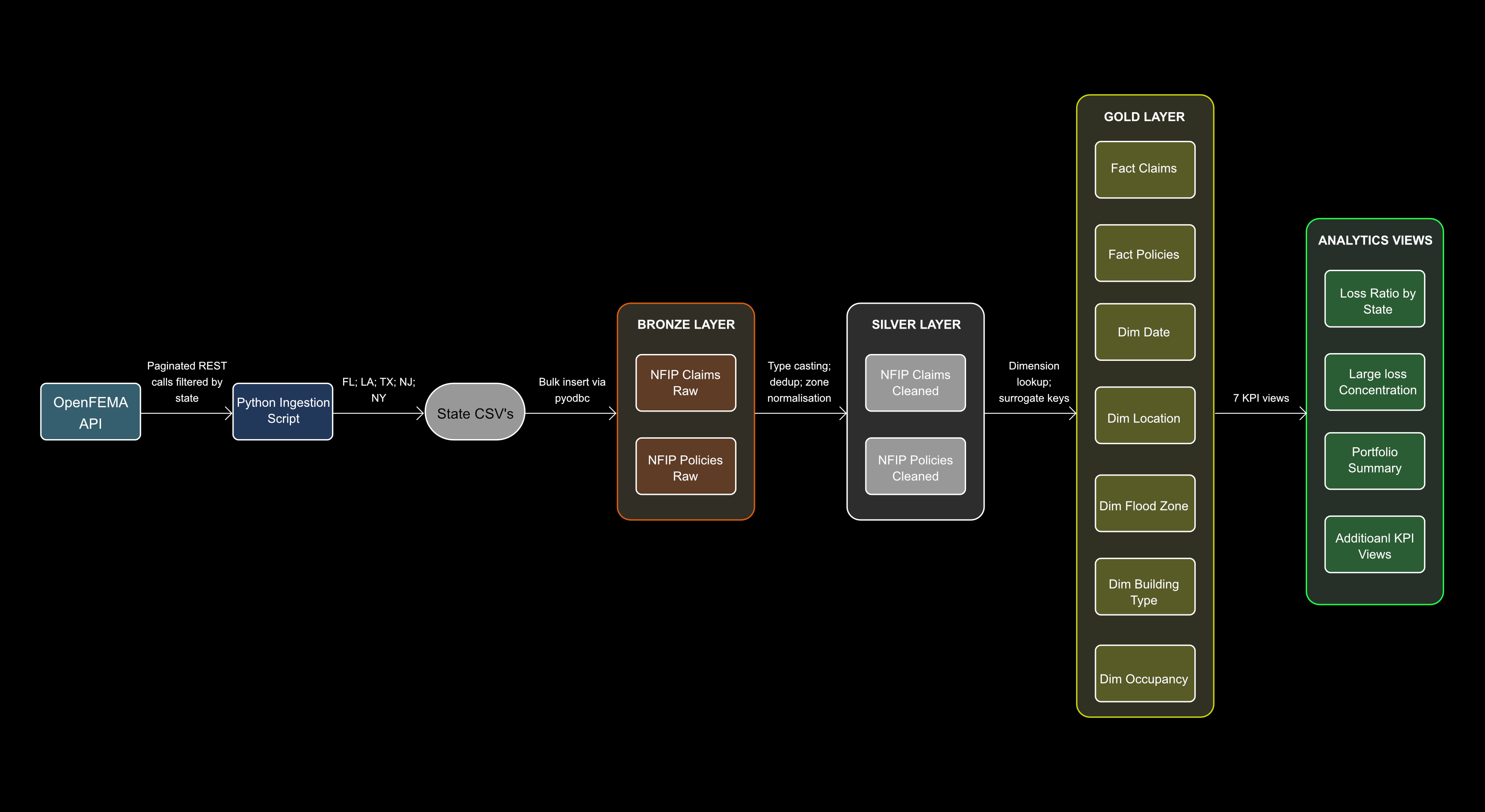
Image 2: Gold Layer Dimensional Model — 2 Fact Tables, 5 Dimensions
Star schema entity relationship diagram — fact_claims and fact_policies joined to five conformed dimensions
The Gold layer star schema centres on two fact tables: fact_claims (1,329,004 rows, grain: one deduplicated claim) and fact_policies (823,465 rows, grain: one deduplicated policy period). Both join to five conformed dimensions — dim_date, dim_location, dim_flood_zone, dim_building_type, and dim_occupancy. fact_policies holds two foreign keys to dim_date (effective_date_key and termination_date_key) to support policy period analysis. All unresolved dimension lookups coalesce to a known Unknown row (key = -1) rather than dropping records.
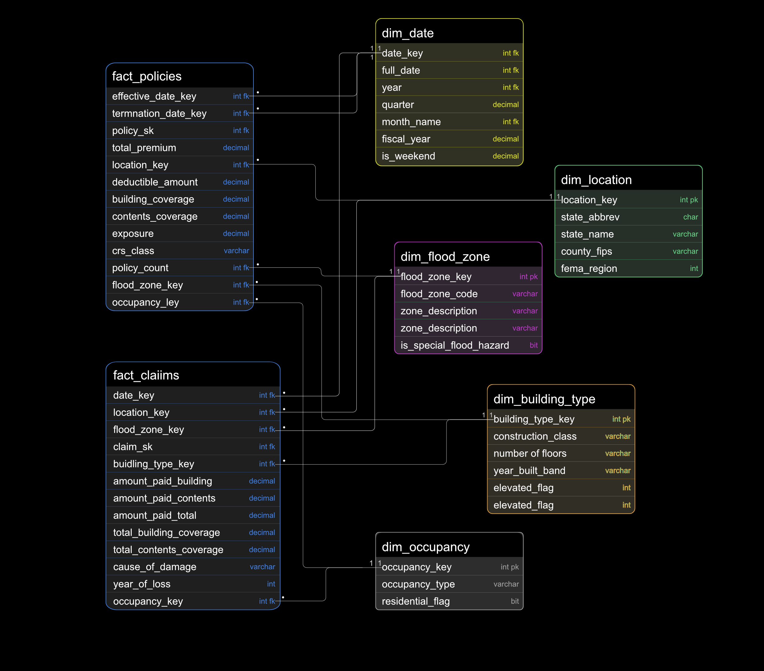
Image 3: ETL Pipeline — Bronze, Silver, Gold Transformation Steps
Transformation logic across all three Medallion layers with record counts
Three-layer transformation pipeline. Bronze ingests raw API data via paginated 10k-record calls filtered to FL, LA, TX, NJ, NY — all values cast to string or None before insert, preserving data as-is with VARCHAR columns. Silver applies TRY_CAST type conversion, COALESCE null handling, ROW_NUMBER() deduplication by composite key, flood zone normalisation (raw codes → A/V/X/D categories), ISO date extraction for construction year, and exposure derivation capped 0–1. Of 1,703,977 Bronze claims, 1,328,816 survive to Silver — a documented 22% drop. Gold generates the date dimension via WHILE loop, loads five dimension tables with Unknown fallback rows, joins Silver facts to dimensions via surrogate key lookup, and creates seven KPI analytics views.
Data Visualisations
The Gold layer analytics views were used to generate seven charts directly from the warehouse query output. Each chart answers a specific underwriting or portfolio management question using real NFIP data across five states and up to 47 years of claims history.
Loss Ratio by State and Year
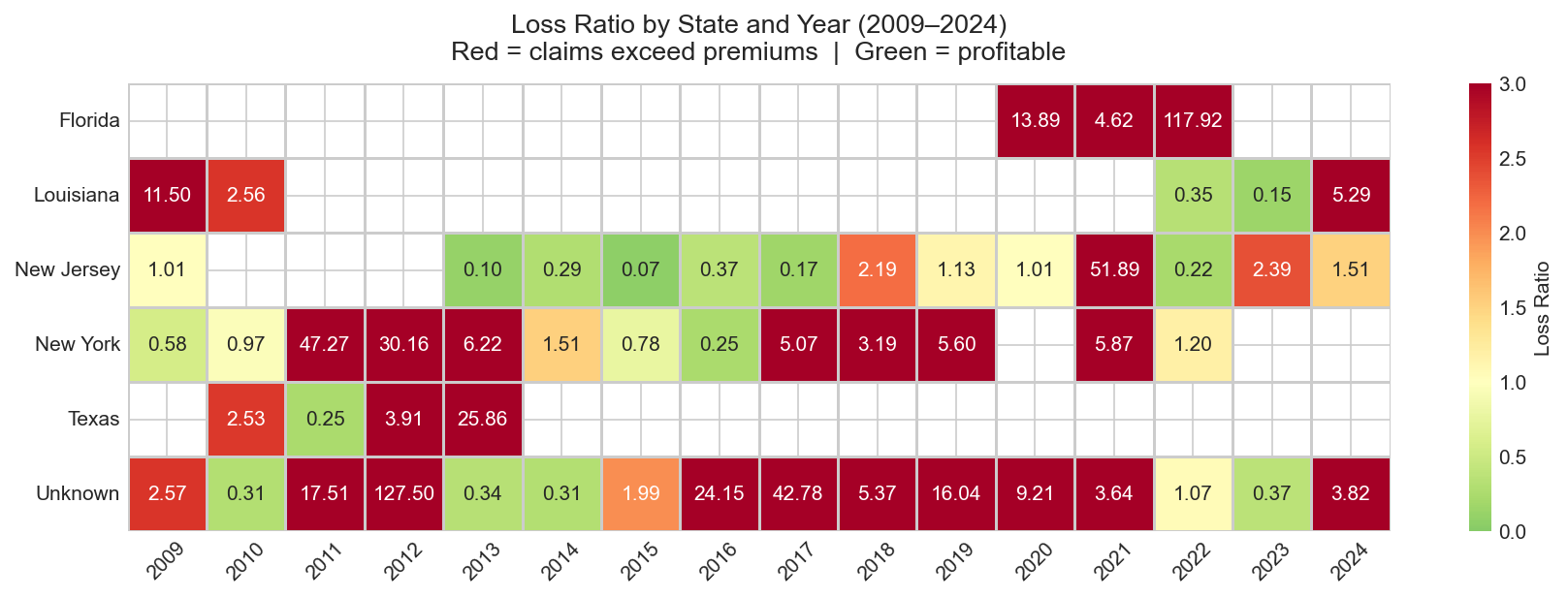
Heatmap — claims paid ÷ premium by state and year; red cells indicate years where claims exceeded premium collected
Loss ratio heatmap across all five states from 2009 to 2024. Katrina (2005), Sandy (2012 — NJ and NY), and Harvey (2017 — TX) are visible as concentrated loss spikes. The heatmap makes the geographic and temporal clustering of catastrophic years immediately legible — a pattern that would take minutes to extract from a raw table. Some state-year combinations show inflated ratios due to the 200k per-state policy API cap, a known constraint documented in the data quality notes.
Claims Development by Accident Year
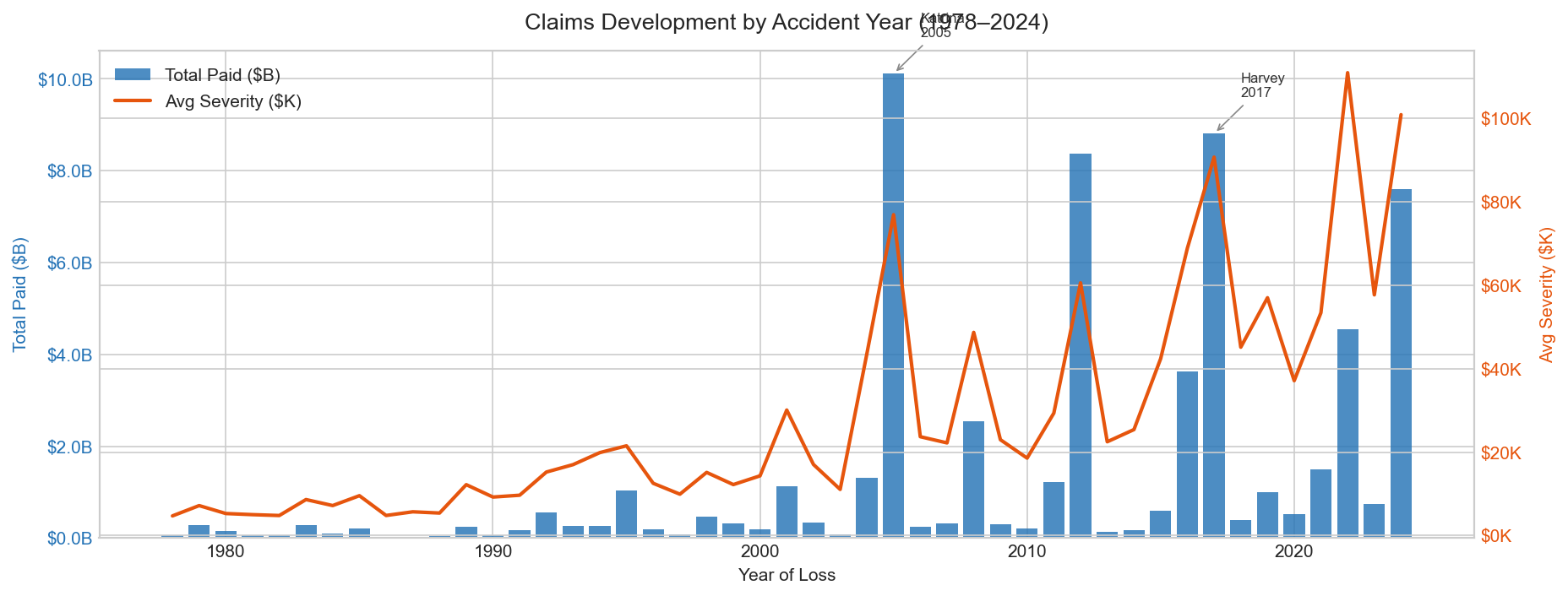
Bar and line chart — total claims paid ($B) and average severity ($K) across 47 accident years, 1978–2024
Dual-axis chart showing total paid (bars, left axis) and average severity per claim (line, right axis) across every accident year in the NFIP dataset. Katrina 2005 produced 131,431 claims and $10.1B in total paid. Harvey 2017 produced the highest average severity on record at $90,735 per claim despite lower total claim volume than Sandy 2012. The rising severity trend line from 1978 to present reflects both increasing property values in flood-prone areas and more severe individual flood events over time.
Large Loss Concentration by State
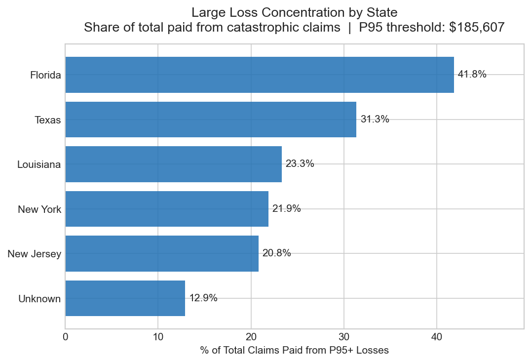
Stacked bar chart — share of total claims paid from catastrophic losses (above P95 threshold of $185,607) by state
Measures the proportion of each state's total paid losses that comes from claims above the 95th percentile threshold of $185,607. Florida accounts for 41.8% of all catastrophic loss dollars across the portfolio, Texas 31.3%, Louisiana 23.3%. This tail-driven concentration is characteristic of flood insurance and has direct implications for catastrophe reinsurance structure — a small number of large events drive a disproportionate share of total incurred losses.
Severity by Flood Zone
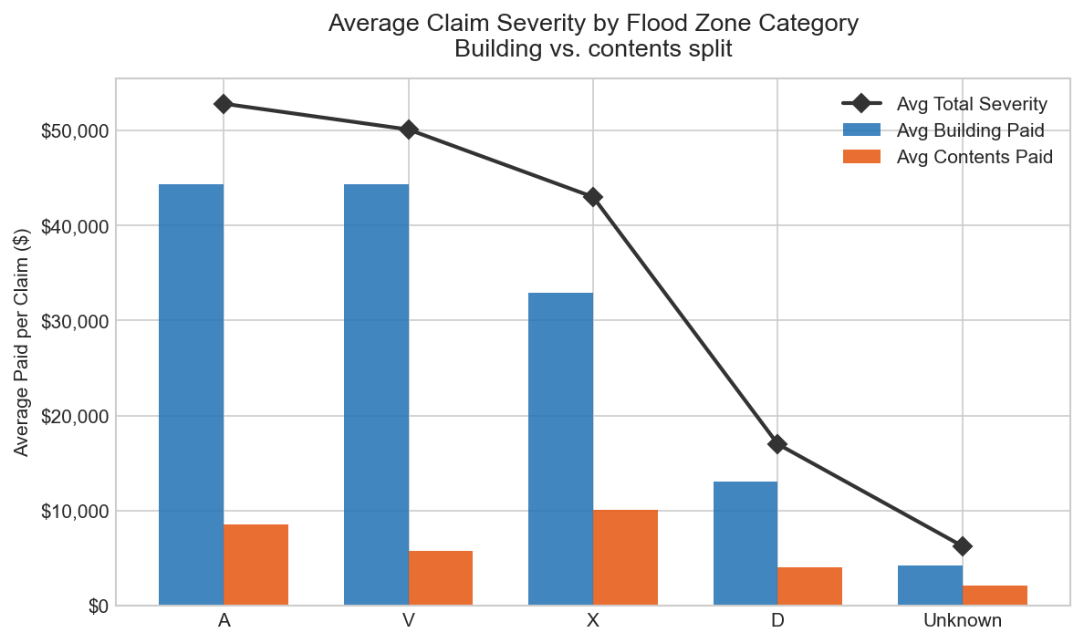
Grouped bar chart — average claim severity split by building and contents damage across NFIP zone categories
Compares average claim severity and the building vs contents damage split across the four NFIP zone categories. Zone V (coastal, wave action) shows the highest building damage share at 88.5% of losses — consistent with storm surge destroying structures while contents losses remain comparatively lower. Zone A (inland fluvial, 858,904 claims) averages $52,836. Zone X (moderate to minimal risk) averages $43,017 — a 19% reduction from high-risk zones, validating the SFHA classification as a meaningful pricing signal.
Portfolio Summary 2009–2024
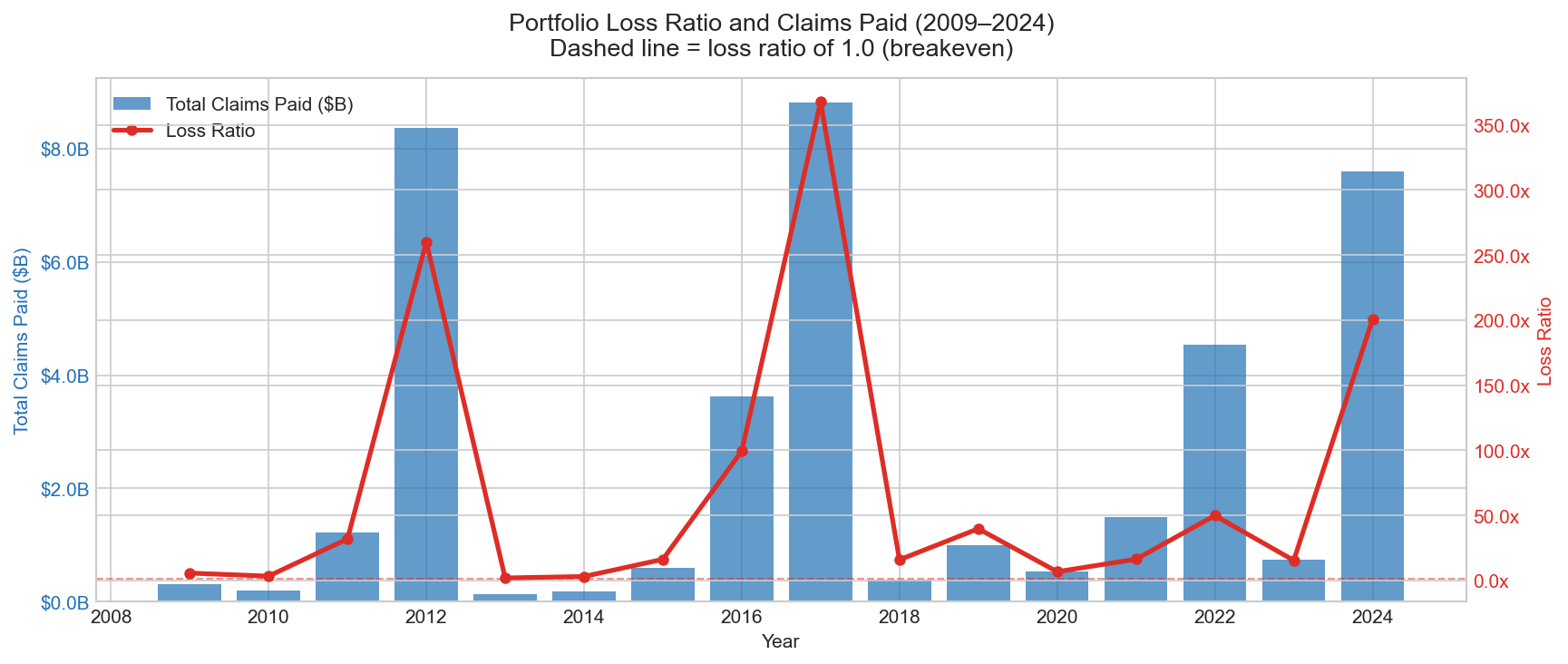
Combo chart — year-over-year total claims paid (bars) against loss ratio (line); dashed line marks the 1.0 breakeven point
Year-over-year view of total claims paid against loss ratio from 2009 to 2024. The dashed breakeven line at loss ratio = 1.0 separates profitable years from years where NFIP paid out more than it collected. Loss ratios above 1.0 in catastrophe years reflect the program's structural reliance on Treasury borrowing during major flood events — a known feature of the NFIP's funding model and a central issue in current US flood insurance reform discussions.
Claims Frequency vs Severity by Flood Zone
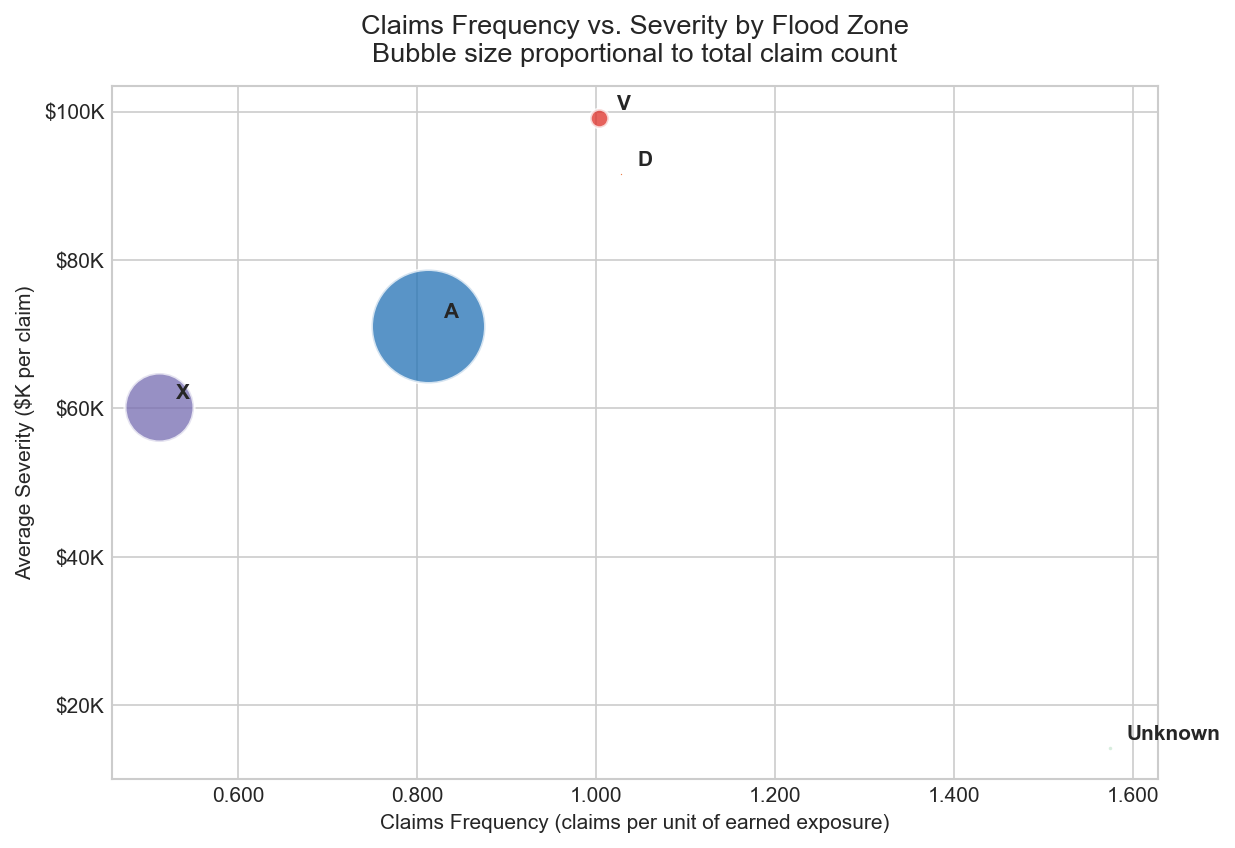
Bubble scatter plot — frequency (claims per exposure, x-axis) vs average severity ($ per claim, y-axis); bubble size proportional to total claim volume
Decomposes portfolio loss by flood zone into two independent dimensions: how often claims occur (frequency) and how large they are when they do (severity). Zone A drives the highest frequency given its volume. Zone V (coastal) shows the highest severity per claim. This segmentation validates the SFHA zone classification as a risk pricing signal — zones with high frequency do not necessarily have high severity, and vice versa. The bubble size encoding adds a third dimension (total claim volume) without adding a separate chart.
Premium Adequacy by Occupancy Type
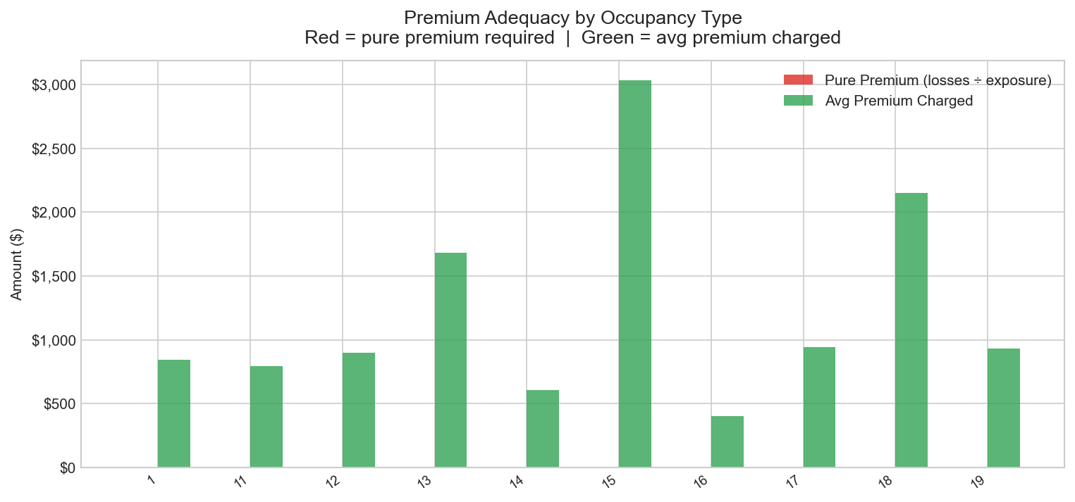
Grouped bar chart — pure premium (red) vs average premium charged (green) by occupancy type; red exceeding green indicates underpriced segments
Compares pure premium (total losses divided by earned exposure) against average premium charged across occupancy types. Where the red bar exceeds green, premiums are insufficient to cover expected losses on an actuarial basis. Segments showing no green bar indicate occupancy codes present in claims data but absent from the capped policy sample — a data quality constraint documented in data_quality_notes.md. This view directly addresses one of the core questions underwriters ask of any flood portfolio: are we pricing the risk correctly?